The new generation of the premium Pixel 4 smartphone from Google is designed to meet all the necessary parameters and should be a pleasant device with a perfect look! Arthur Kenzo, who participated in its design, introduced us to the background of the development of this unique technological “buddy”.
How did the design process go and how long did it take to create the Pixel 4 design?
It took the team two years of design to launch Pixel 4, from ideation sketching, to prototyping, all the way to the final product.
What specific role did you play in designing? Was it a new experience for you working for Google?
I was one of the Industrial Designers working on the project. To me, what was really different from other projects I worked on was the scale of the project. Working for a Google product means designing for a very large number of users, which is a lot larger and more complex than other projects. For example, the display dimensions not only influence the user interface layout, but also the feel of hand grip, so we had to design Pixel dimensions very carefully so it feels good in everybody’s hand.
What was the most difficult part of designing this smartphone?
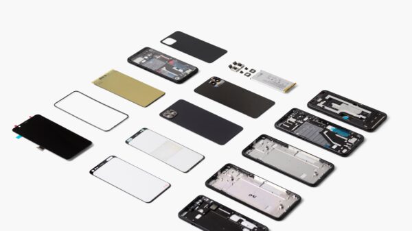
The most difficult part of design Pixel 4 was the integration of all the advanced technologies and camera modules into one compact and simple design.
What story are you telling through this phone? You wanted to create a more stylish look or elegant pattern?
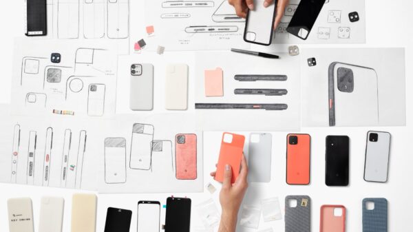
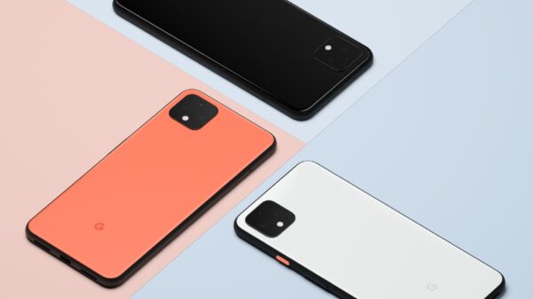
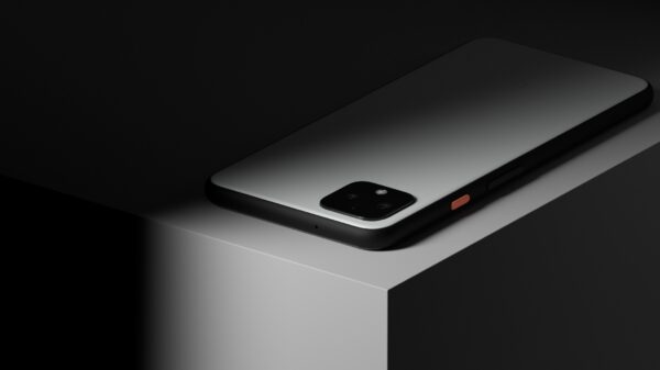
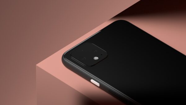
The design Narrative for Pixel 4 is focused on those key principles, Approachable, Optimist and Bold. Pixel 4 was designed to be soft in the hand and approachable, human. The form has been carefully sculpted out of aluminum and Gorilla Glass 5. Our design is confidently different, approachable and simple. Our sophisticated yet fresh approach to materials, colors and finishes is uniquely Google. Our design celebrates the simplicity of the form by highlighting each element in a very graphic way, the high contrast tones denote the function of each part. We clustered all the rear imaging sensors into the iconic square camera detail for simplicity.
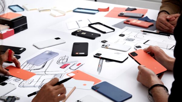
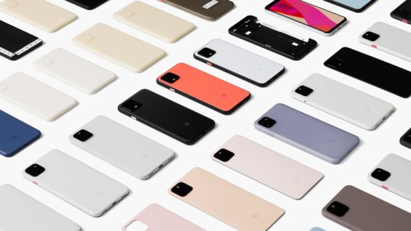
We see that you had a lot of colors and patterns on the table, what inspired you the most? You’ve probably looked at competing products as well, which of them inspired you the most or “kicked” you?
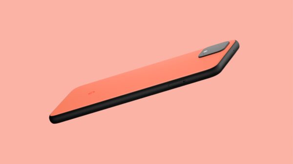
The use of color in Pixel 4 is functional yet expressive. The pop of the power button highlights its function, and the rear glass color adds a touch of optimism when you turn the device around. The finishes of all elements have been carefully chosen, celebrating the nuances of the form. For all other elements we have applied a soft matte finish to continue our tactility narrative and celebrate the craft in a confident, unique way that represents and feels like Google.
Design: Google Industrial Design Team & Arthur Kenzo
Photo: Google
